Ikea furnitures EDA
I am loving the tidytuesday challenges cause of the way they stretch my thinking particularly on data visualization skills. Took some time to flex my EDA skills with the TidyTuesday challenge data from Ikea home furnishing company. There are quite a number of things to inspect but I’ll just have a look at a few.
Data import
ikea <- readr::read_csv('https://raw.githubusercontent.com/rfordatascience/tidytuesday/master/data/2020/2020-11-03/ikea.csv')
Loading libraries
library(dplyr)
library(plotly)
library(ggridges)
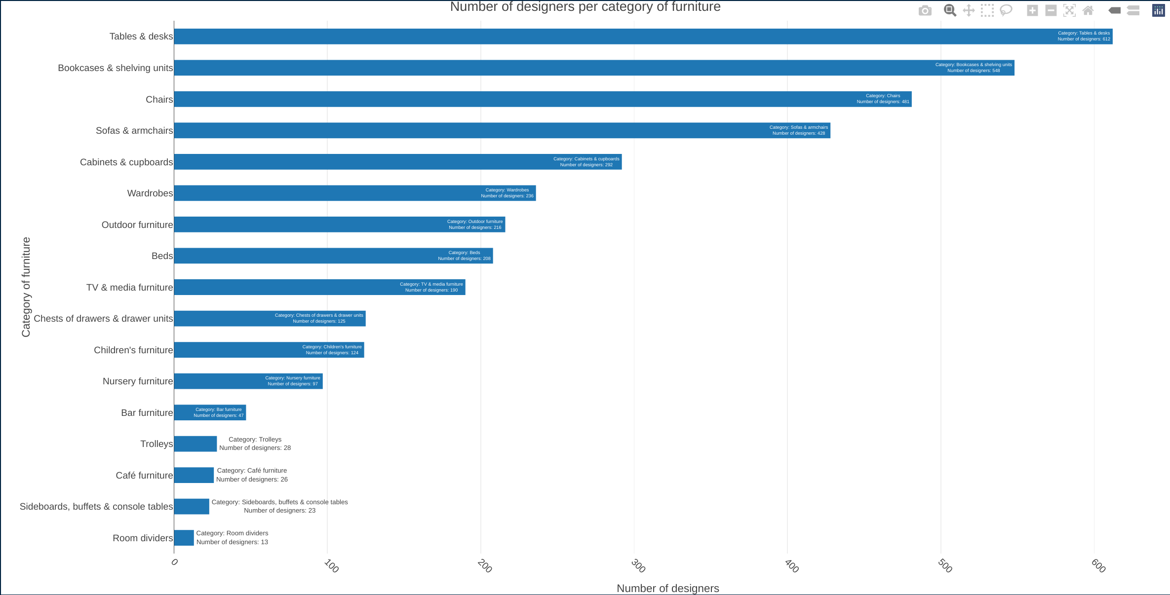
How’s the rank of furniture categories with regard to number of designers?
I thought it interesting to see which category of furnitures had the highest number of designers. Its clear from the bar graph below that Tables and desks had the highest count followed closely by Book cases and shelving units.
I love the interactivity of plotly. With a hover on the bars you can see the furniture category and the corresponding number of designers.
ikea_cat_des <- ikea %>%
  dplyr::group_by(category) %>%
  dplyr::count(designer) %>%
  dplyr::summarise(n=sum(n))


plot_ly(ikea_cat_des,
                y = ~reorder(category,n),
                x = ~n,
                colors = 'PuRd',
                showscale = FALSE,
                showlegend = FALSE,
                text = ~paste0("Category: ", category, "\n", "Number of designers: ", n)) %>%
          add_bars( hoverinfo='text') %>%
          hide_colorbar() %>%

        layout(bargap = 0.5,
              group = ~category ,
              title = paste("Number of designers per category of furniture"),
              xaxis = list(title = "Number of designers",tickangle = 45

              ),
              yaxis=list(title="Category of furniture"),
              dtick = 1,
              tick0 = 0,
              tickmode = "array")
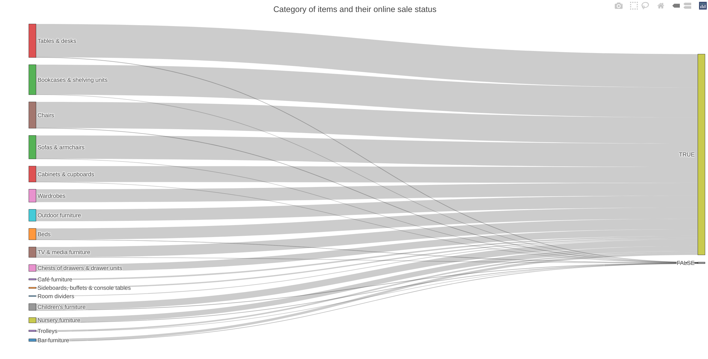
How’s the comparison of item categories that are sellable online and those that are not?
I love the way a sankey diagram highlights the fact that a large percentage of items are sellable online. As we can note from the diagram, the following items are not sellable online entirely:
- cafe furniture,
- sideboards, buffets and console tables and
- Room dividers
whereas for the other categories, only a small percentage of items are not sellable online.
category_selleable_online <- ikea %>%
  dplyr::group_by(category,sellable_online) %>%
  dplyr::count(sellable_online)


 colnames(category_selleable_online) <- c("source", "target", "value")

      category_selleable_online$source <- stringr::str_trim(category_selleable_online$source)
      category_selleable_online$target <- stringr::str_trim(category_selleable_online$target)

      category_selleable_online$target <- paste(category_selleable_online$target, " ", sep = "")

      nodes <- data.frame(name=c(as.character(category_selleable_online$source), as.character(category_selleable_online$target)) %>% unique())

      category_selleable_online$IDsource = match(category_selleable_online$source, nodes$name)-1
      category_selleable_online$IDtarget = match(category_selleable_online$target, nodes$name)-1


   sankey_plot <- plot_ly(category_selleable_online,
        type = "sankey",
        node = list(
          label = nodes$name,
          pad = 15,
          thickness = 15,
          line = list(
            color = "black",
            width = 0.5
          )
        ),

        link = list(
          source = category_selleable_online$IDsource,
          target = category_selleable_online$IDtarget,
          value =  category_selleable_online$value,
          label = nodes$name
        )
      )  %>%
      layout(
        title = "Category of items and their online sale status",
        xaxis = list(showgrid = F, zeroline = F),
        yaxis = list(showgrid = F, zeroline = F),
        margin = list( t = 50)
      )
 sankey_plot
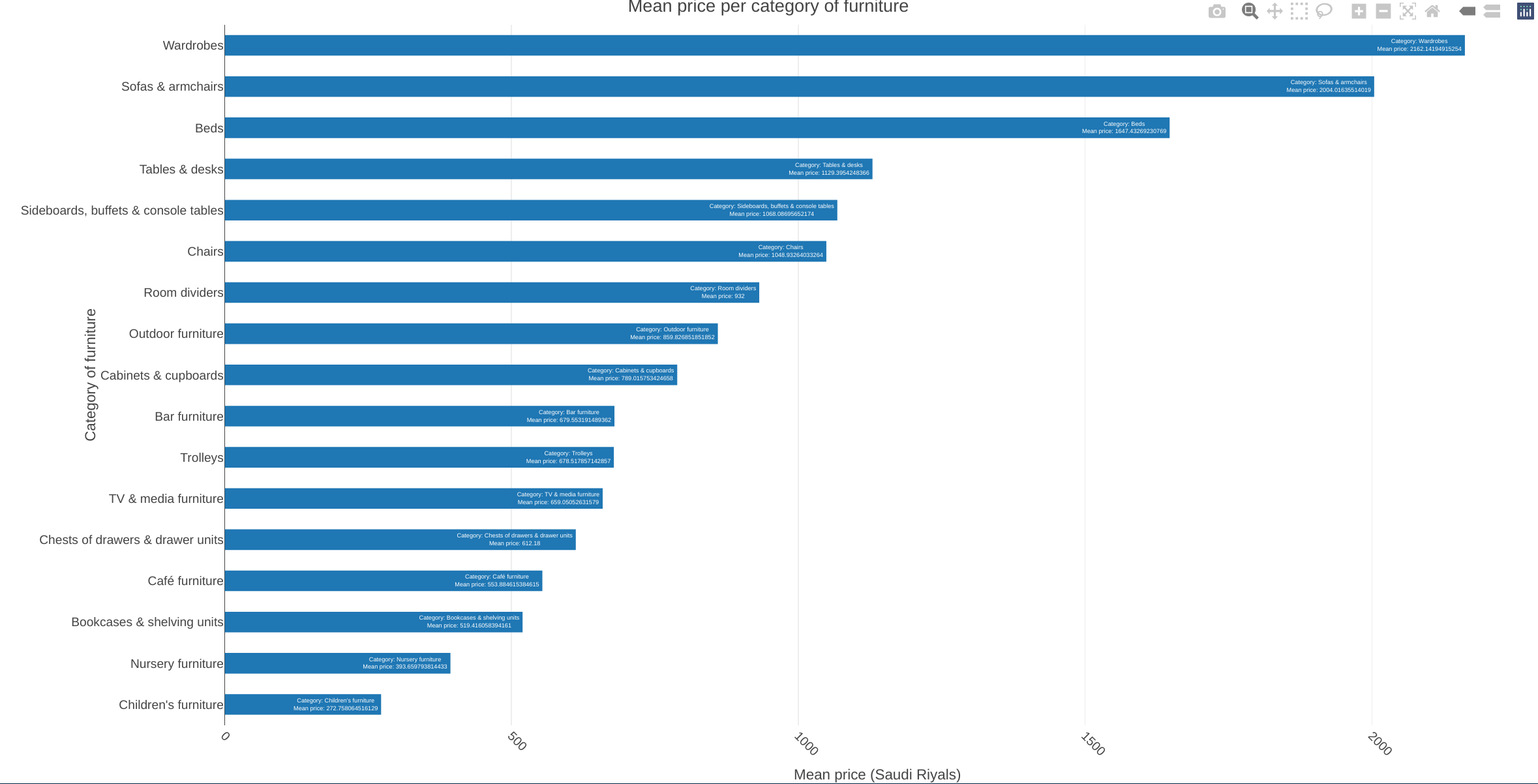
How do the furniture categories compare in terms of Mean price?
ikea_cat_price <- ikea %>%
  dplyr::group_by(category) %>%
  dplyr::summarise(mean_price=mean(price))


plot_ly(ikea_cat_price,
                y = ~reorder(category,mean_price),
                x = ~mean_price,
                colors = 'PuRd',
                showscale = FALSE,
                showlegend = FALSE,
                text = ~paste0("Category: ", category, "\n", "Mean price: ", mean_price)) %>%
          add_bars( hoverinfo='text') %>%
          hide_colorbar() %>%

        layout(bargap = 0.5,
              group = ~category ,
              title = paste("Mean price per category of furniture"),
              xaxis = list(title = "Mean price (Saudi Riyals)",tickangle = 45),
              yaxis=list(title="Category of furniture"),
              dtick = 1,
              tick0 = 0,
              tickmode = "array")
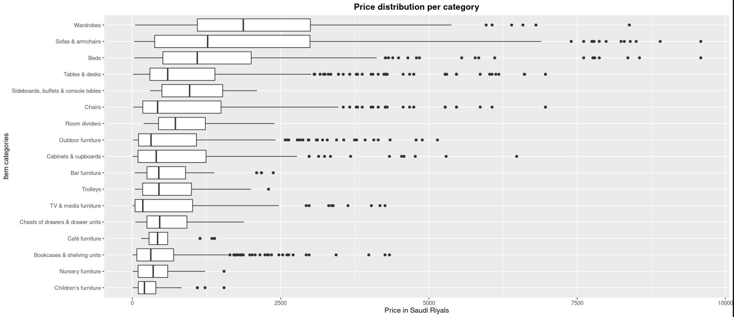
Checking the price distributions of the furniture categories
item_price_distribution <- ikea %>%
  dplyr::group_by(category, price)


ggplot(item_price_distribution,aes(x = price, y = reorder(category, price))) +
  geom_boxplot() +
  labs(title = "Price distribution per category", ylab = "Item categories", xlab = "Price in Saudi Riyals") +
  theme(plot.title = element_text(hjust = 0.5, face = "bold"))