Data visualization
Data visualization is a branch of descriptive statistics that helps us to get insights from data. With graphics, we can explore the data to try and unpack underlying patterns which might be hidden in the data, as such, not easily perceivable just by plainly looking at the data.
After you’ve cleaned and wrangled your data, as a data scientist, you would want to do exploratory data analysis to check for suggestive patterns before you do your model building and your data viz skills would come in handy at this point. But even after you’re done with modelling you will need to communicate your results through data visualization.
In this article I’ve done a collection of the common graphics with some code to get you started, at least for the starters. This document helps me personally given that I may not memorize all the codes for all visualizations that I have used and I thought it wise to share peradventure someone finds it useful as well._(It’s a bit shallow though and you might find some mistakes here and there but I’ll be updating it with the lapse of time.)
knitr::opts_chunk$set(echo = TRUE, warning = FALSE,message = FALSE)
library(plotly)
library(ggplot2)
library(data.table)
library(ggridges)
library(gridExtra)
student_performance <- fread("https://raw.githubusercontent.com/oyogo/data/main/StudentsPerformance.csv")
# download the data here: https://www.kaggle.com/spscientist/students-performance-in-exams

# change column names
cols <- colnames(student_performance)
new_colnames <- c("gender","race_ethnicity","parent_edulevel","lunch","test_preparation_course","math","reading","writing")

student_performance <- setnames(student_performance, cols,new_colnames)
Melt the data into long format
Some bit of data wrangling to transform the data into a format fit for visualization.
stud_perf_melt <- melt(student_performance, id.vars = c("gender","race_ethnicity","parent_edulevel","lunch","test_preparation_course"),
                              measure.vars = c("math","reading","writing"),
                              variable.name = "subject", value.name = "score")
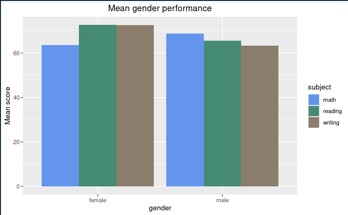
Barplot
I find this to be the most commonly used plot. A bar chart not only helps us see the variations in a variable, but with it we can also compare two or more variables.
# using plotly
stud_perf_melt[,.(mean_score=mean(score)),by=c("gender","subject")] %>%
  plot_ly(
                  x = ~gender,
                  y = ~mean_score,
                  color = ~subject,
                  text = ~paste0("Gender: ", gender, "\n", "Subject: ", subject,"\n","Mean score: ",mean_score)) %>%
               add_bars(showlegend=FALSE, hoverinfo='text' ) %>%
  layout(title="Mean gender performance")


# with ggplot
stud_perf_melt[,.(mean_score=mean(score)),by=c("gender","subject")] %>%
ggplot(aes(x = gender, y = mean_score, fill=subject)) +
  geom_col(position = "dodge") +
  scale_fill_manual(values = c("#6495ED", "#458B74", "#8B7D6B")) +
  labs(title = "Mean gender performance") +
theme(plot.title = element_text(hjust = 0.5))
Line graph
A line chart shows trends over time. You can have your time variable on the x-axis and the corresponding quantity on the y-axis. Its used in a case where we have two continous variables.
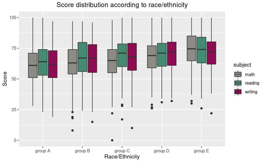
Boxplot
# plotly way
stud_perf_melt[,by=c("race_ethnicity","subject")] %>%
        plot_ly(
               x = ~race_ethnicity,
               y = ~score,
               type = "box",
               color = ~subject,
               showlegend = TRUE
       ) %>%
         layout(boxmode="group",
                title = "Score distribution with respect to ethnic groups",
                yaxis=list(title="Score"))


# ggplot way
stud_perf_melt[,by=c("race_ethnicity","subject")] %>%
ggplot(aes(x=race_ethnicity,y=score,fill=subject)) +
  geom_boxplot() +
  labs(title = "Score distribution", subtitle="Race/Ethnic group", y="score") +
  theme(plot.title = element_text(hjust = 0.5),
        plot.subtitle = element_text(hjust = 0.5)) +
  scale_fill_manual(values = c("#8B8B83", "#458B74", "#8B0A50"))
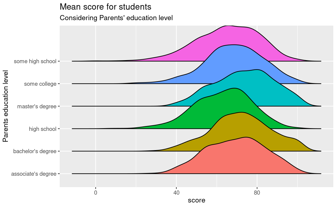
Density ridges
stud_perf_melt %>%
  ggplot(aes(y=parent_edulevel, x=score, fill = parent_edulevel)) +
  geom_density_ridges2() +
  labs(title = "Mean score for students",
       subtitle = "Considering Parents' education level",
       y="Parents education level") +
  theme(legend.position = "none")
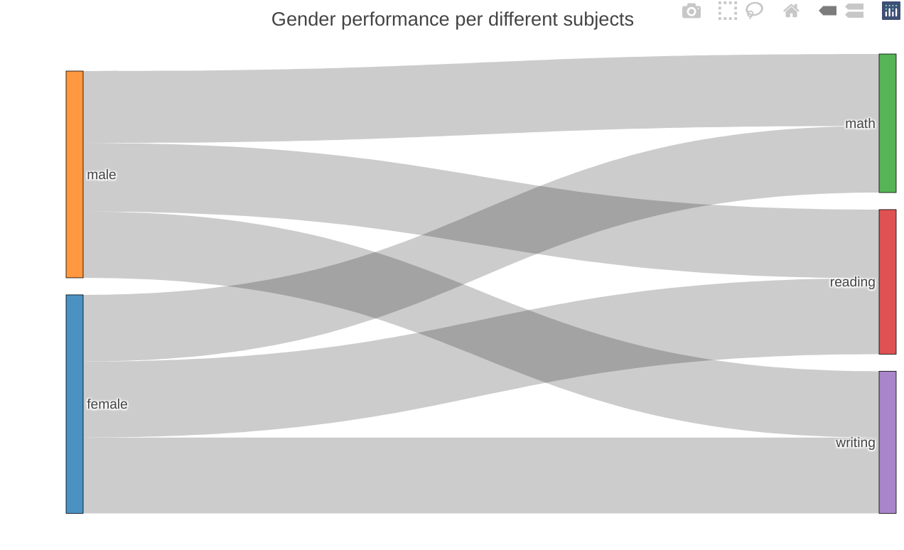
Sankey diagram
sankey_data <- stud_perf_melt[,.(mean_score=mean(score)),by=c("gender","subject")]

colnames(sankey_data) <- c("source","target","value")


sankey_data$target <- paste(sankey_data$target,"",sep = "")

      nodes <- data.frame(name=c(as.character(sankey_data$source), as.character(sankey_data$target)) %>% unique())


      sankey_data$IDsource = match(sankey_data$source, nodes$name)-1
      sankey_data$IDtarget = match(sankey_data$target, nodes$name)-1


      plot_ly(
        type = "sankey",
        node = list(
          label = nodes$name,
          pad = 15,
          thickness = 15,
          line = list(
            color = "black",
            width = 0.5
          )
        ),

        link = list(
          source = sankey_data$IDsource,
          target = sankey_data$IDtarget,
          value =  sankey_data$value,
          label = nodes$name
        )
      )  %>%
        layout(
          title = "Gender performance per different subjects",
          #font = f.b,
          xaxis = list(showgrid = F, zeroline = F),
          yaxis = list(showgrid = F, zeroline = F),
          margin = list( t = 50) #,
          # plot_bgcolor  = "rgba(0, 0, 0, 0)",
          # paper_bgcolor = "rgba(0, 0, 0, 0)"
        )
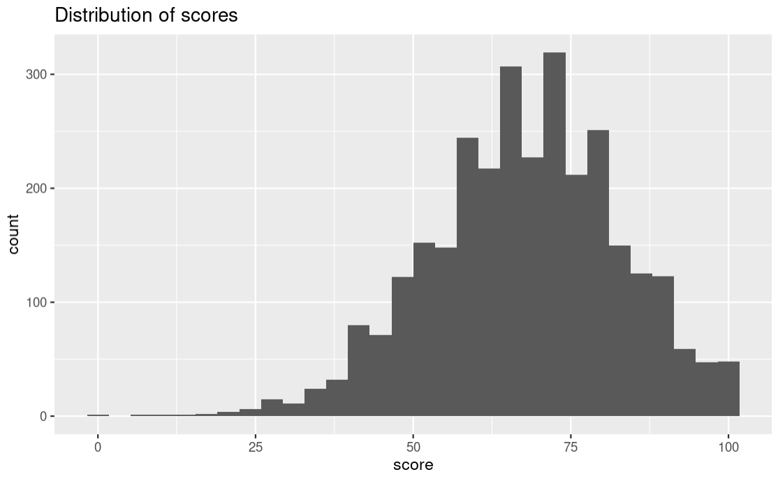
Histogram
We use a histogram to measure the frequency of a variable. On the x-axis you will have the bins(intervals of the variable) and the corresponding frequencies on the y-axis. A good example I could think of is population data where we have counts of people in different age groups. The different groups would be the bins and the count of people in that group is the frequency. For this data we have score categories as our bins and the student count for each category as the frequency.
  ggplot(stud_perf_melt,
         aes(x = score)) +
            geom_histogram() +
  labs(title = "Distribution of scores")
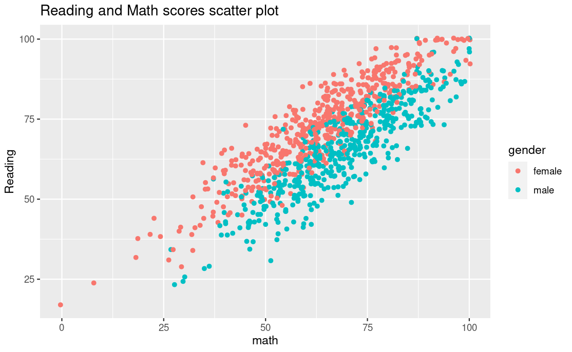
Scatter plot
Some variables in your dataset may be correlated to whatever magnitude, if you suspect they do then doing a scatter plot would help to show the correlations if there are any.
Its interesting to see the way the scatter plot not only suggests a correlation between math and reading scores but further suggests that females perform better than male in reading while male perform well in math than the female. This is possible just because we added the color element to our plain scatter plot.
You can choose to play around with the aesthetic elements of the plot just to try and see if there any insights that might pop up from the data.
student_performance %>%
  ggplot(aes(x=math,y=reading,color=gender)) +
  geom_jitter() +
  ggtitle("Reading and Math scores scatter plot")
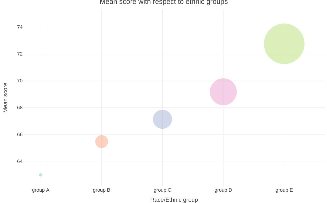
Bubble chart
I’d like to consider a bubble chart as tweaked scatter plot whereby each point is illustrated as a bubble. However, this form of visualization would fit well in a situation where the data points are not so many otherwise the graph would look so clunky.
Its quite interesting to note how in the bubble chart below we can clearly see the significant differences in the mean score of students across the different ethnic groups.
stud_perf_melt[,.(mean_score=mean(score)),by=c("race_ethnicity")] %>%
plot_ly() %>%
        add_trace(x = ~reorder(race_ethnicity, mean_score),
                  y = ~mean_score,
                  size = ~mean_score,
                  color = ~race_ethnicity,
                  alpha = 1.5,
                  #sizes = c(200,4000),
                  type = "scatter",
                  mode = "markers",
                  marker = list(symbol = 'circle', sizemode = 'diameter',
                                line = list(width = 2, color = '#FFFFFF'), opacity=0.4)) %>%
        add_text(x = ~reorder(race_ethnicity, -mean_score),
                        y = ~race_ethnicity, text = ~mean_score,
                        showarrow = FALSE,
                        color = I("black")) %>%
        layout(
          showlegend = FALSE,
          title="Mean score with respect to ethnic groups",
          xaxis = list(
            title = "Race/Ethnic group"
          ),
          yaxis = list(
            title = "Mean score"
          )
        ) %>%
        config(displayModeBar = FALSE, displaylogo = FALSE,
              scrollZoom = FALSE, showAxisDragHandles = TRUE,
              showSendToCloud = FALSE)
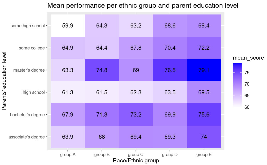
Heatmap
A heat map is basically a color-coded matrix. A formula is used to color each cell of the matrix is shaded to represent the relative value or risk of that cell.
Colors are indeed ‘eye-catching’, we can for example in the heatmap below see that students from ethnic group E and whose parents have a masters degree have a high average performance.
stud_perf_melt[,.(mean_score=mean(score)),by=c("race_ethnicity","parent_edulevel")] %>%
  ggplot(aes(x=race_ethnicity,y=parent_edulevel,fill=mean_score)) +
  geom_tile() +
  geom_text(aes(label=round(mean_score,1))) + # this is the function that helps us to label the cells
  scale_fill_gradient(low = "white",high = "blue") + # you can use your own colors using this function
  labs(title="Mean performance per ethnic group and parent education level",y="Parents' education level",x="Race/Ethnic group") # Customizing your axis labels and title
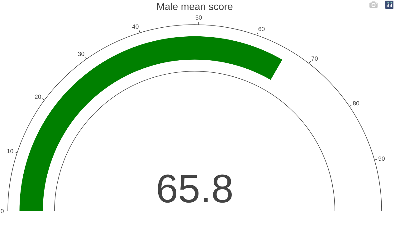
Gauge
A gauge can be used to illustrate the distance between intervals. This can be presented as a round clock-like gauge or as a tube type gauge resembling a liquid thermometer. Multiple gauges can be shown next to each other to illustrate the difference between multiple intervals.
 plot_ly(
    domain = list(x = c(0, 1), y = c(0, 1)),
    value = 69.6,
    title = list(text = "Female mean score"),
    type = "indicator",
    mode = "gauge+number") %>%
  layout(margin = list(l=20,r=30))


 plot_ly(
    domain = list(x = c(0, 1), y = c(0, 1)),
    value = 65.8,
    title = list(text = "Male mean score"),
    type = "indicator",
    mode = "gauge+number") %>%
  layout(margin = list(l=20,r=30))
on the next update I’ll do some leaflet, line graph and a tree diagram
For more materials, references and further reading:
- Get the RStudio ggplot2 cheatsheet here
- If you want a deep dive into ggplot2 this book can be of help